sanctuary family health
brand development
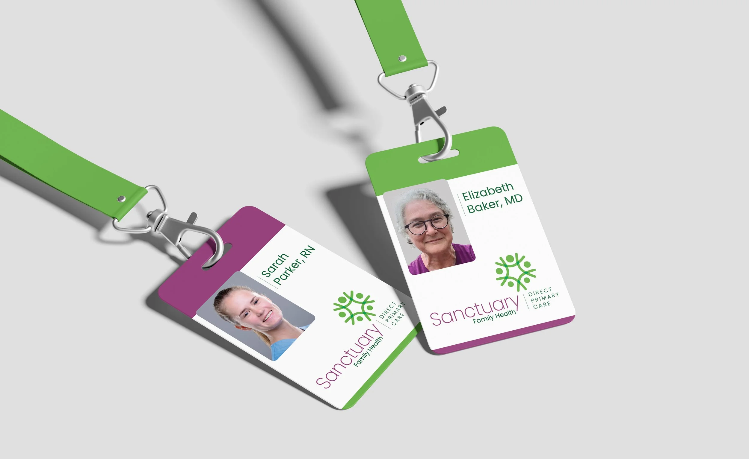
Sanctuary Family Health is a small, suburban medical practice with a strong commitment to providing inclusive, patient-centered care. The client sought to create a welcoming and comfortable atmosphere that would make patients feel connected, included, and supported throughout their experience. A key goal of the project was to establish an environment that felt personal yet professional, while remaining distinct from the often highly corporate and standardized atmosphere associated with larger medical practices.
Services
Brand and Identity Development
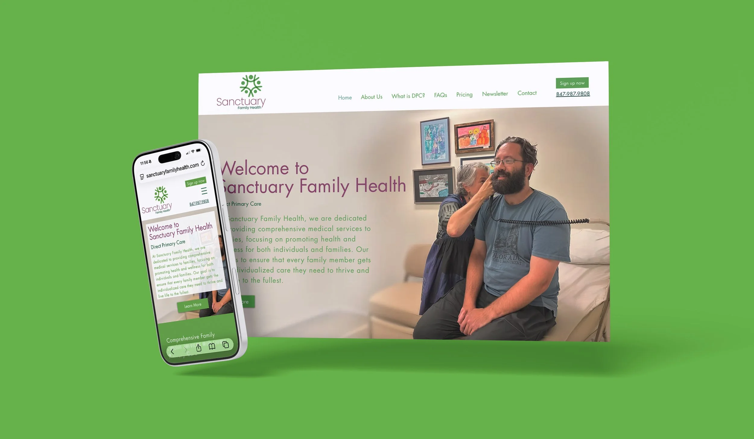
Website Development - including portal
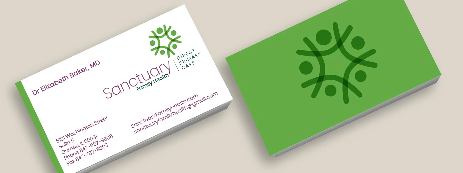
Marketing materials
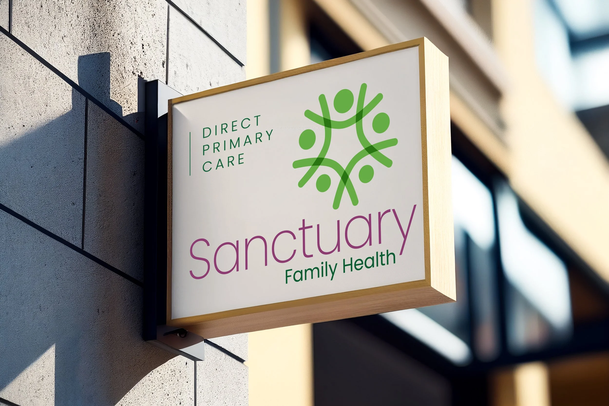
Signage
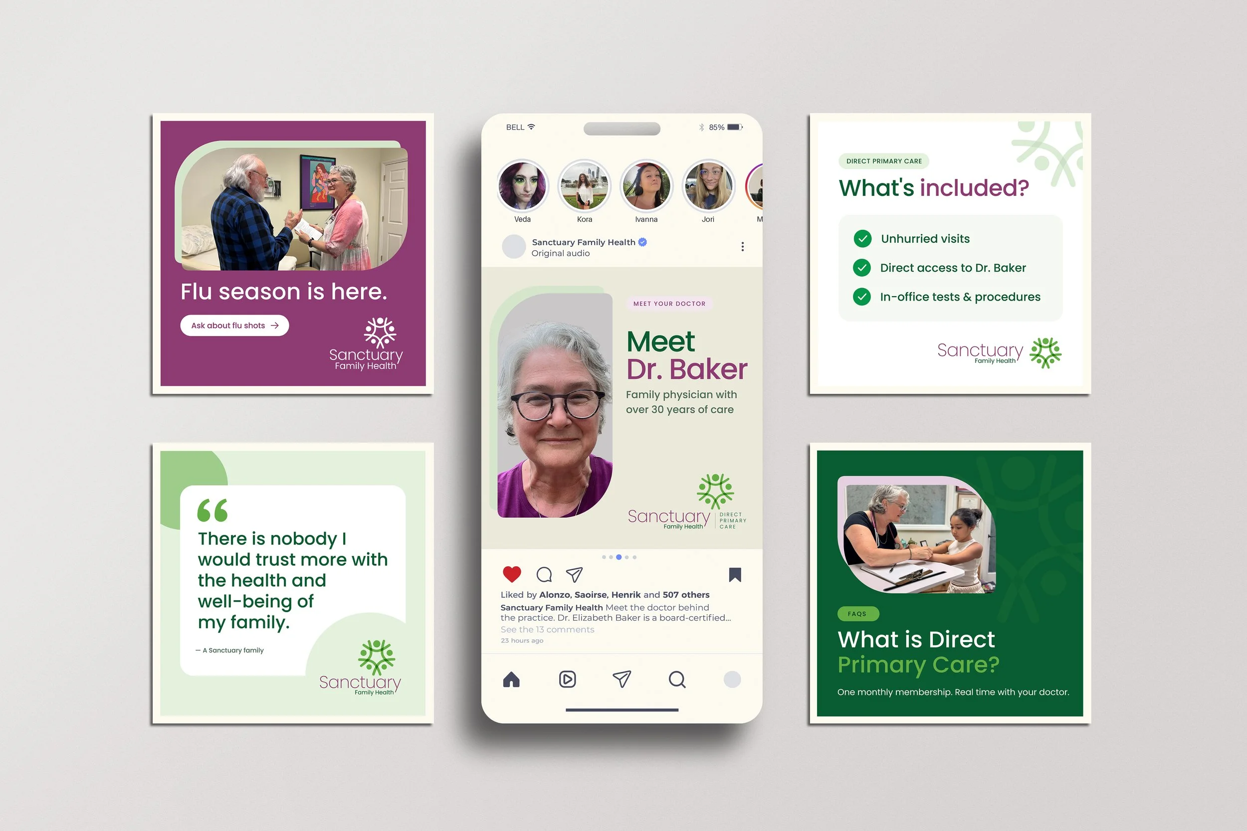
Social media campaign
Credits
Kristi Jalove, Meg & Me Design: Creative Direction, Art Direction, Production
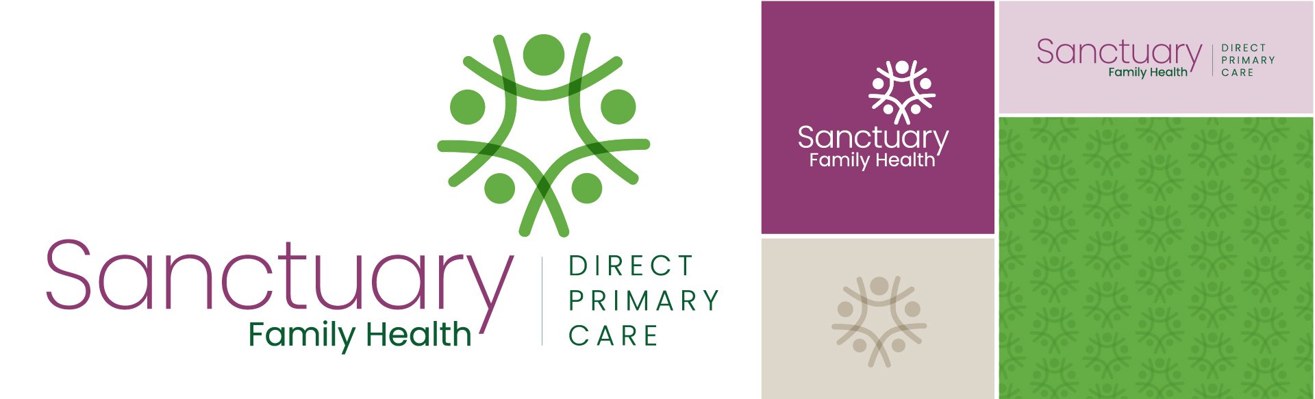
Working with Dr. Baker to define her core values was a critical first step in creating visuals to match her message. Equally important was the name itself. “Sanctuary,” a place of safety, healing and refuge, refers not only to the physical office but also to the patient’s own body. The brand needed to unite these two meanings while expressing the partnership between doctor and patient on each health journey. Every touchpoint, from marketing materials to the office itself, uses a color palette and brand system that reflects Sanctuary’s calming, holistic and welcoming presence.
The symbol represents family and direct connection while evoking nature, growth and holistic care. Its enclosing circle reinforces the idea of sanctuary as a place where patients feel cared for and nurtured. The heads within the mark vary in size, a subtle nod to the practice’s adult and pediatric patients.
Sanctuary is a Direct Primary Care practice which is new and unfamiliar model for many people, so a social campaign focusing on education and recommendations was part of the launch of the brand. Posts answered top questions and reassured new patients of the highly respected and sought-out care of Dr. Baker in the community. The staff also sponsored and attended local events with the focus of education and building trust.